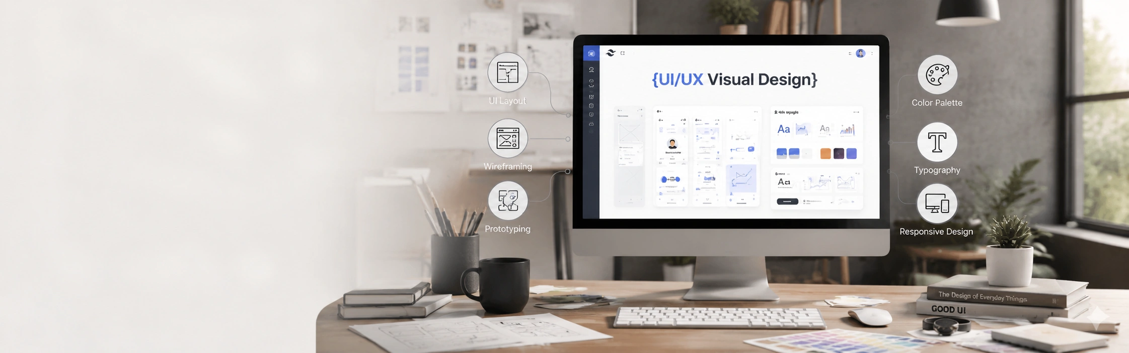
Our UI UX Visual Design Services
From web application interfaces to design systems and mobile product screens every dimension of visual UI/UX design covered.
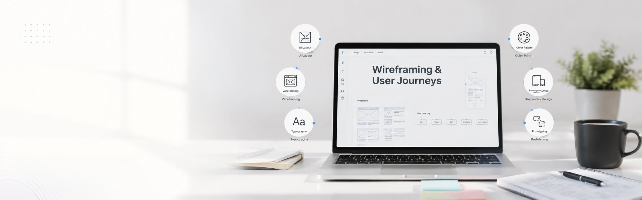
Encrypted InfoWeb delivers professional wireframing and user journey design services for startups, SaaS products, ecommerce platforms, and enterprise teams that need to align on how a product works before spending a single development day building the wrong thing. Serving clients across the United States, United Kingdom, Germany, Australia, and the UAE.
Book Free Consultation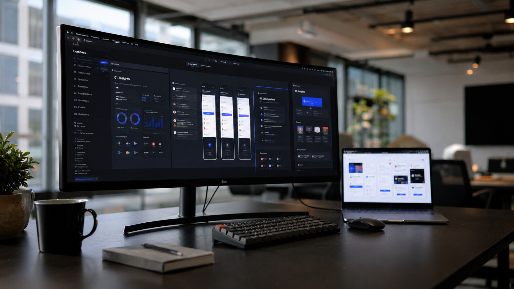
10+ Years
Experience in digital delivery
200+ Projects
Across web, apps & software
Global Client Coverage
Global delivery & collaboration
NDA Ready
Confidential, IP-aware workflows
UI UX visual design services involve creating the high-fidelity visual interface of a digital product applying colour systems, typography, iconography, spacing, and component design to a wireframe structure. The result is a pixel-perfect, on-brand interface that is accessible, aesthetically coherent, and optimised for the user actions that matter commercially ready for developer handoff.
Most clients arrive with at least one of these. If any look familiar, you are in the right place.
Users make trust decisions in under three seconds based on visual quality. An interface with inconsistent spacing, clashing colours, and mismatched typography signals that the product behind it may be equally unreliable regardless of how well it functions.
Different screens designed by different team members at different times result in a patchwork interface that feels unfinished. Users notice inconsistency even when they cannot articulate it. It shows up as reduced engagement and increased support contacts about UI confusion.
Without annotated design files, component libraries, and defined spacing systems, developers interpret designs independently and the built product diverges from the approved design. Design QA becomes a constant cycle of correction rather than a final check.
UI trends move. What looked modern in 2020 looks dated today and users notice when your interface feels behind the standard of competing products. An interface that looks older than the competition creates a perception gap your product quality cannot always overcome.
UK public sector contracts, US federal accessibility requirements, and European WCAG standards are increasingly enforced. An interface without accessible colour contrast, focus states, and screen reader considerations is a compliance liability as much as a UX problem.
A product interface that looks disconnected from the company's website, logo, and marketing materials creates a disjointed brand experience that erodes the credibility both touchpoints are trying to build. Visual design must connect to brand identity deliberately not by coincidence.
Here is who gets the most from professional UI UX visual design services and what each type of client gains.
Your product needs to look credible enough for enterprise buyers and good enough for investors before you have the user numbers to prove the concept. A professionally designed interface communicates that you are ready to be taken seriously.
Your dashboard is your product. If users cannot navigate it intuitively or the visual hierarchy does not guide them to key actions, they churn. We design SaaS interfaces where usability and visual quality are engineered together not traded against each other.
Internal tools and B2B products across the US, UK, and Germany need interfaces that handle data density, role-based views, and complex workflows without becoming visually overwhelming. We design for cognitive load reduction as a primary constraint.
Every element of a commerce interface product imagery presentation, price hierarchy, trust signals, and CTA design is a visual design decision with a measurable effect on conversion rate. We design ecommerce interfaces for revenue, not recognition.
From web application interfaces to design systems and mobile product screens every dimension of visual UI/UX design covered.
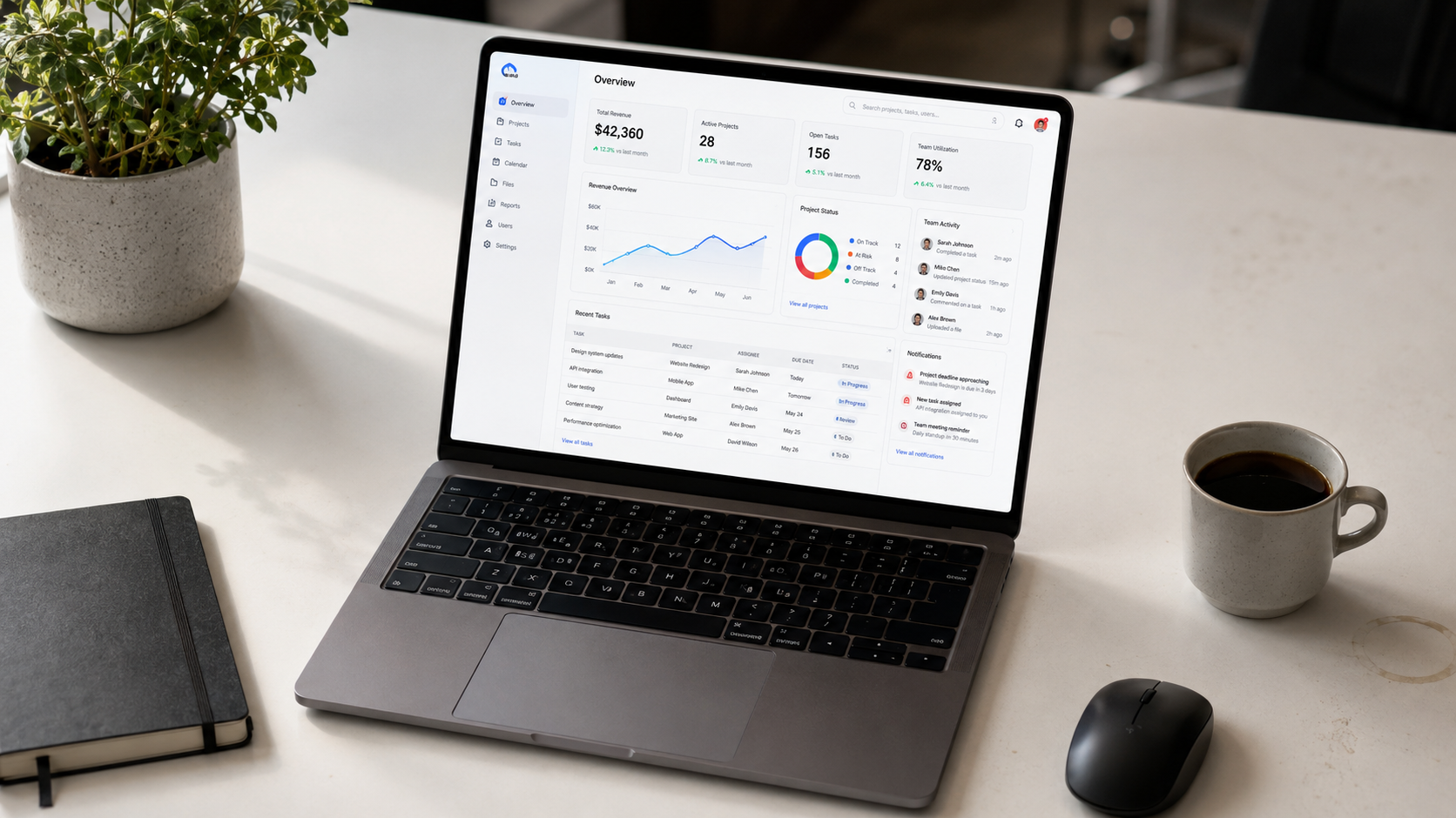
We design high-fidelity web application interfaces SaaS dashboards, admin panels, data management tools, and internal portals with a visual hierarchy that guides users to critical actions without cognitive overload. Colour, typography, component spacing, and iconography are all resolved at the design system level, not screen by screen. Explore our web development services for build integration.
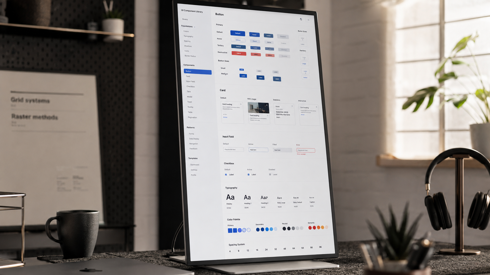
A shared component library with defined colour tokens, typography scale, spacing system, and interaction states is what separates a product that scales cleanly from one that accumulates visual inconsistency with every new feature. We design Figma component libraries with documented usage rules, accessibility annotations, and dark mode variants that your design and engineering teams use as the single source of visual truth. See our frontend development services for implementation.
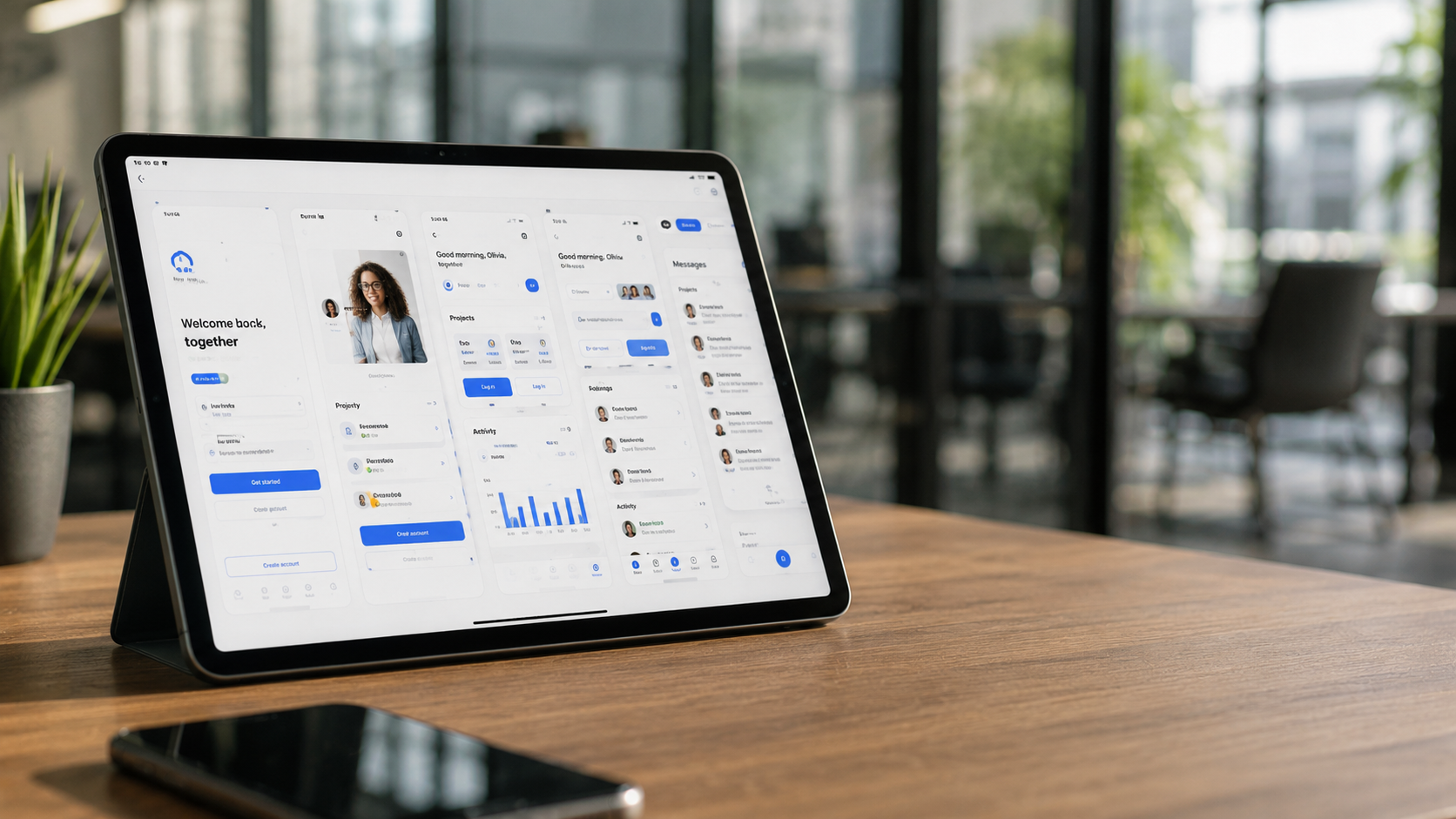
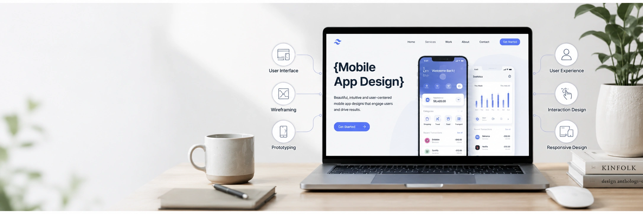
We apply visual design to mobile app wireframes producing pixel-perfect iOS and Android screens with platform-appropriate typography, touch target sizing, safe area handling, and dark mode support. Every screen is designed to Apple Human Interface Guidelines or Material Design 3 standards, with all component states (default, hover, focus, error, disabled) documented for the development team. See our full mobile app design services.
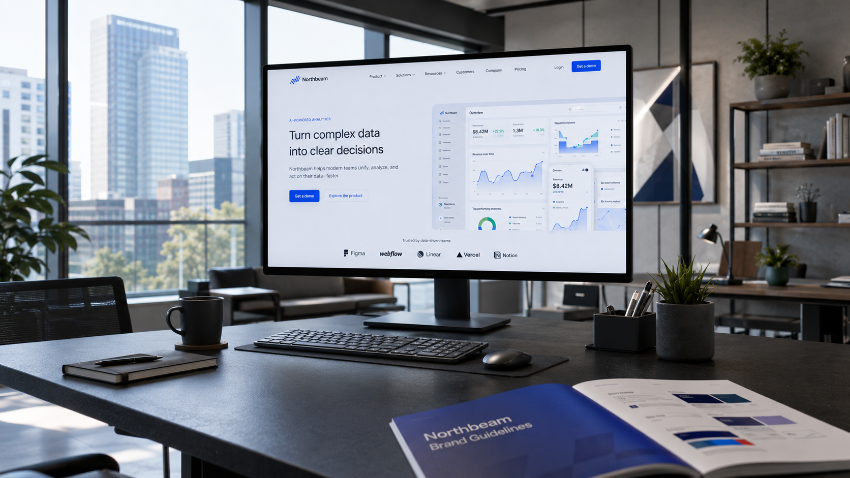
When a company has strong brand identity logo, colour palette, typography but a product interface that does not reflect it, the disconnect erodes trust at every session. We translate brand identities into product design systems: deriving UI colour tokens from brand palettes, selecting interface typography that complements but does not replicate marketing typefaces, and building component designs that feel visually continuous with the brand without sacrificing UI function. See our logo design services if branding work is needed first.
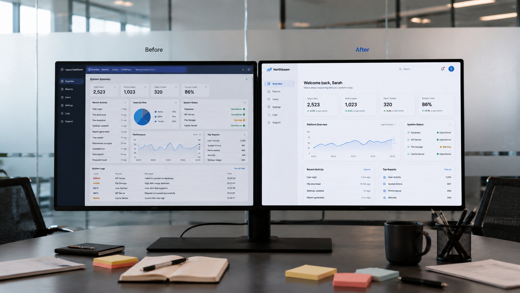
An outdated interface costs you users who compare your product to competitors before deciding to stay. We audit the current interface for visual inconsistency, accessibility failures, and dated design patterns then redesign with a modern design system that preserves the product logic users know while eliminating the visual debt that signals a neglected product. Wireframing happens before visual redesign begins see our wireframing services.
A structured, milestone-based process from brief to developer-ready Figma files with full stakeholder visibility throughout.
We cover product goals, brand identity inputs, existing design system (if any), target audience, and platform requirements. NDA signed before any discussions begin. Deliverable: design brief, reference audit, and agreed visual direction.
We establish the colour system, typography scale, spacing grid, and core components before producing any full-screen designs. This phase sets the visual language for every screen that follows. See our wireframing services if structural UX work is needed first.
We produce pixel-perfect Figma screens for all flows in scope desktop and mobile variants, all component states, and both light and dark mode where required. Two structured revision rounds are included before sign-off.
WCAG 2.1 AA colour contrast checks, focus state verification, annotation for screen reader behaviour, and cross-platform visual consistency review. Nothing proceeds to handoff until the design passes our full QA checklist.
Annotated Figma files, design token documentation, component library, and asset exports delivered. We provide design QA reviews during development to ensure the build reflects the approved design before launch.
Industry-standard tools that produce deliverables your design and development teams can use directly without platform dependency on us.


200+ businesses across the US, UK, Germany, Australia, and UAE have chosen Encrypted InfoWeb. Here is what sets our approach apart.
We have designed digital interfaces across web, mobile, and cross-platform products for a decade understanding how visual decisions affect retention, task completion, and commercial outcomes at a level that junior design teams learn through expensive mistakes.
We never design visuals before the wireframe and user flow is agreed. Aesthetics serve structure not the other way around. See our wireframing services for the foundation stage that precedes every visual design engagement.
WCAG 2.1 AA colour contrast, keyboard navigation support, focus state design, and screen reader annotations are standard on every project not a premium add-on. UK, US, and European clients increasingly require this at contract level.
Annotated Figma files, component states, design tokens, and spacing specifications delivered with the level of precision that means your developers build what was designed, not what they interpreted the design to mean.
We understand what credibility looks like visually to a US B2B buyer, a German enterprise procurement team, and a UAE C-suite audience and adapt colour, density, and typographic choices accordingly across different market contexts.
Visual design feeds directly into frontend development and web development within the same team. No handoff gap between design and build one studio, one contract, end-to-end.
Visual design requirements differ significantly by sector and we bring industry-specific thinking to every interface we design.
Investor-credible, user-facing product design that communicates quality and intent before you have testimonials to prove it. Scalable design systems from day one.
Dashboard design that makes complex data navigable, feature-dense products intuitive, and onboarding flows clear enough to reduce time-to-value from first login.
WCAG-compliant, HIPAA-aware interface design for patient portals and clinical tools where visual clarity directly affects task accuracy and user trust.
Product page visual hierarchy, checkout flow design, and trust signal placement all visual decisions with a direct and measurable effect on conversion rate.
High-density interface design for enterprise tools across the US, UK, and UAE role-based views, data visualisation, and multi-level navigation without visual overwhelm.
Our remote-first delivery model provides consistent visual design quality for clients worldwide with the communication and documentation standards each market requires.
Visual design for US product teams and enterprises across New York, San Francisco, and Austin fast delivery, direct communication, and interfaces that meet the visual standard US B2B and consumer audiences expect from software they pay for.
WCAG-compliant, GDPR-aware interface design for UK clients in London, Manchester, and Edinburgh with full GMT timezone overlap and the professional precision British B2B and public sector clients require from design deliverables.
Precise, structured UI design for German businesses in Berlin, Munich, and Frankfurt DSGVO-compliant, visually systematic, and documented to the standard that German enterprise procurement and engineering teams expect.
Visual UI design for Australian product teams across Sydney, Melbourne, and Brisbane direct, structured, and delivered on schedule with async-first communication that makes cross-timezone collaboration straightforward..
Premium UI/UX visual design for businesses across Dubai, Abu Dhabi, and the GCC with RTL layout design capability, multilingual component systems, and the visual quality that competitive UAE digital markets demand.
Let's design an interface your users trust from the first screen and keep using because it works as well as it looks.