Our Responsive Mobile-First Web Design Services
From initial UI/UX planning to post-launch optimisation, each service is specifically scoped for mobile-first, cross-device responsive website development.

Encrypted InfoWeb builds high-performance, mobile-first responsive websites engineered for real-world usage not just pretty screenshots. Every layout we design starts on mobile and scales intelligently to tablet and desktop, delivering fast load speeds, seamless user experiences, and SEO-ready foundations out of the box. Whether you're a SaaS startup, an ecommerce brand, or an enterprise expanding internationally, your website needs to work flawlessly for users who are increasingly mobile by default. We make sure it does.
Book Free Consultation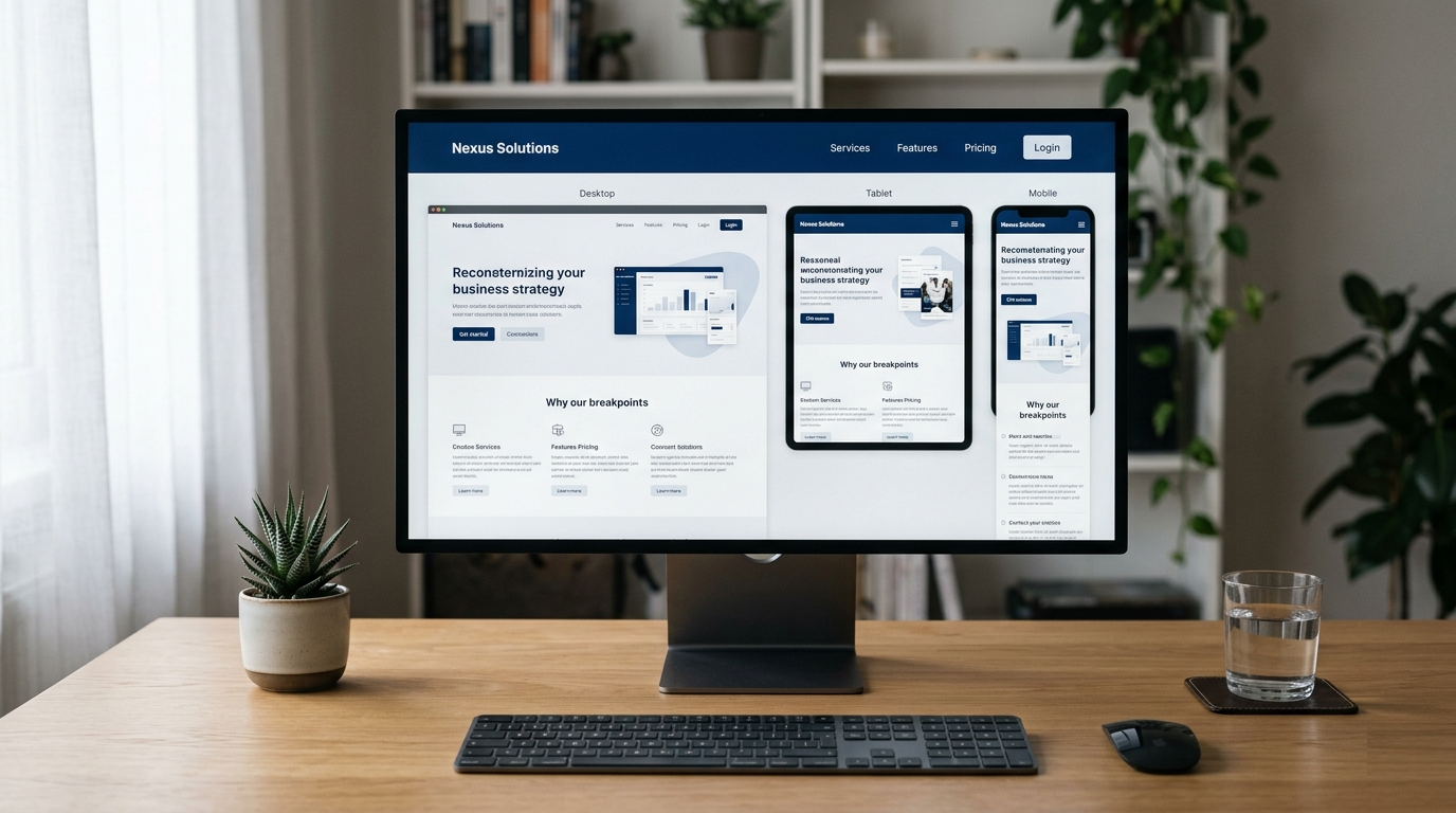
10+ Years
Experience in digital delivery
200+ Projects
Across web, apps & software
Global Client Coverage
Global delivery & collaboration
NDA Ready
Confidential, IP-aware workflows
Responsive mobile-first web design is the practice of designing and developing websites beginning with the mobile layout, then scaling upward to tablet and desktop. It prioritises touch-friendly navigation, fast page loads, and fluid grid systems to deliver a consistent, high-quality experience across all screen sizes and devices.
Responsive mobile-first design is a web design and development methodology where the mobile version of a website is built first with minimal, essential content and touch-optimised layout before being progressively enhanced for larger screens. It improves performance, ensures Google mobile-first indexing compatibility, and delivers a seamless cross-device user experience from day one.
Menus that don't open, buttons that are too small to tap, and text that overflows on small screens. These are avoidable problems that drive away mobile visitors before they read a single word of your offer.
Google indexes and ranks the mobile version of your website. If your mobile experience is incomplete, slow, or visually broken, your desktop rankings suffer regardless of how polished the desktop version looks.
Desktop-first websites are routinely bloated with oversized images and heavy scripts that were never optimised for mobile bandwidth. The result is slow loads that lose users within the first three seconds.
LCP, CLS, and INP benchmarks are direct ranking factors. Websites built without a mobile-first approach consistently fail these metrics costing positions in search results and frustrating the users who do arrive.
Your brand should look and feel equally authoritative on a 13" laptop, a 10" tablet, and a 5" smartphone. When it doesn't, you communicate a lack of attention to detail that erodes trust with potential buyers.
WCAG accessibility requirements overlap significantly with mobile-first best practices. Touch target sizing, colour contrast, and readable typography are both legal requirements in many markets and fundamental conversion improvements.
Our responsive mobile-first web design services work most effectively for businesses with specific digital ambitions. Here is who we partner with.
Early-stage businesses launching for the first time need a mobile-optimised website that builds credibility instantly. We help startups go live with a professionally designed, responsive website that works perfectly for investors, press, and customers all viewing on different devices.
If your existing site was built several years ago, it was almost certainly designed desktop-first. SMEs come to us to modernise their digital presence with a responsive website that recovers lost mobile traffic and generates consistent inbound leads from organic search.
Enterprise businesses expanding into the US, UK, German, or Australian markets need a responsive frontend that meets the expectations of international audiences with localised UX patterns, fast cross-device performance, and scalable frontend architecture.
In-house teams and agencies managing multiple client projects use us as a reliable white-label responsive design partner. We deliver consistent, high-quality mobile-first website development without the overhead of managing additional internal headcount.
From initial UI/UX planning to post-launch optimisation, each service is specifically scoped for mobile-first, cross-device responsive website development.

We design and build your entire website starting from the 320px mobile viewport not retrofitting a desktop layout. This means every element, from typography scale to button placement, is optimised for the way people actually use their phones. We then layer in tablet and desktop enhancements progressively.
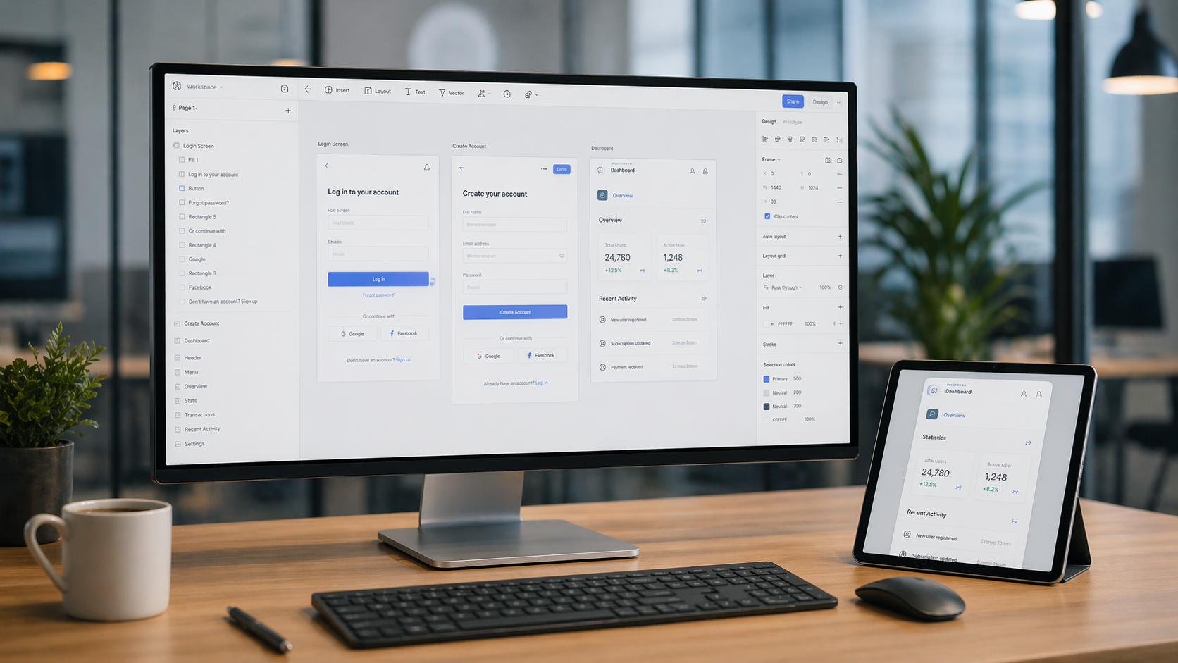
Before a single component is coded, our UX team designs wireframes and high-fidelity Figma prototypes across three breakpoints mobile, tablet, and desktop. We map user journeys specific to touch interactions, define clear visual hierarchy for small screens, and validate design decisions with usability principles.

Responsiveness is not just about layout it's about speed. We compress and serve device-appropriate images using modern formats like WebP and AVIF, implement lazy loading, defer non-critical scripts, and configure CDN delivery for fast loading.

Our frontend developers translate Figma designs into clean, semantic, accessible HTML and CSS using fluid grid systems, CSS custom properties, and modern responsive frameworks. We write code that is maintainable, well-documented, and built to last not brittle hacks that break with the next browser update..

If your existing website was built desktop-first and is now underperforming on mobile, a strategic redesign is the most direct solution. We audit your current site identifying mobile UX failures, layout breakpoints that don't hold, and performance bottlenecks then rebuild with a mobile-first architecture that preserves your existing SEO equity while dramatically improving the mobile user experience.
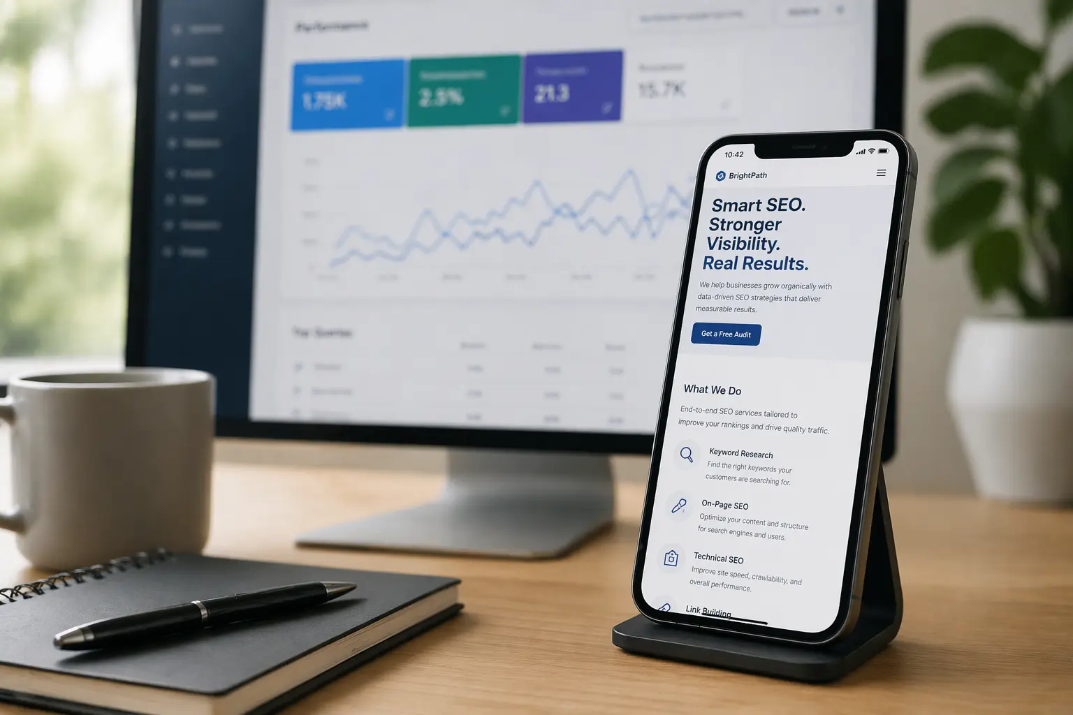
A responsive website that isn't structured for search is only half the job. We embed SEO architecture into every mobile-first build semantic heading hierarchy, structured data markup, clean URL structures, Open Graph tags, sitemap configuration, and metadata strategy that positions your site to rank for the responsive mobile-first web design services and related queries your buyers are actually searching.
A defined process is what separates consistent delivery from unpredictable outcomes. Here is exactly how we work, from first conversation to post-launch support.
We document your business goals, target audience behaviours, device usage patterns, and competitor landscape. An NDA is signed before any discussions begin. We produce a clear sitemap and mobile-first design brief.
Mobile wireframes come first. High-fidelity Figma mockups across all breakpoints follow. We iterate with your feedback until every screen and interaction is signed off before development begins.
Mobile-first HTML, CSS, and JavaScript are written in two-week sprints. Component-based architecture ensures clean, maintainable code. CMS integration, API connections, and third-party tools are embedded cleanly.
We test across 30+ device and browser combinations. Core Web Vitals benchmarking, WCAG accessibility checks, cross-browser rendering validation, and pre-launch SEO audit are all completed before you see anything.
We deploy to your hosting environment, configure GA4 and Search Console, and provide CMS training and full documentation. Post-launch support packages keep your site fast, secure, and improving over time.
We choose technologies based on your project requirements not based on what's easiest for us. Every tool selection is deliberate and performance-driven.


Hundreds of agencies claim to build responsive websites. Here is why businesses across the US, UK, Germany, Australia, and UAE specifically choose Encrypted InfoWeb.
With over a decade of frontend and full-stack engineering experience across 200+ global projects, we bring a level of technical maturity that most responsive design agencies simply don't have. We've solved real mobile-first challenges across healthcare, fintech, SaaS, and ecommerce and we bring that domain knowledge to every new project.
Our UX designers and frontend developers work as one integrated team not two separate departments throwing deliverables over a wall. The result is responsive UI design that is both visually precise and technically faithful. What you approve in Figma is what gets built and deployed, with no quality loss in translation.
We build responsive websites using component-based architecture in React and Next.js not sprawling CSS files that become impossible to maintain. When your business grows and you need to add new pages, features, or integrations, the technical foundation we lay makes that expansion fast and affordable rather than expensive and disruptive.
Core Web Vitals compliance, sub-2.5-second mobile load times, and Lighthouse scores above 90 are not aspirational targets for us they are minimum standards we hold ourselves to on every build. We measure, optimise, and validate performance before handover, not after client feedback arrives.
We've delivered mobile-first responsive websites for businesses in New York, London, Frankfurt, Sydney, and Dubai each with different UX expectations, accessibility standards, and market maturity. That international experience translates directly into better design decisions for your specific audience.
We work in structured two-week sprints with shared project visibility via Notion and Figma. You receive milestone updates proactively not because you chased us. Our clients consistently highlight communication quality as a key differentiator, particularly those in the UK and Germany where precision and accountability are non-negotiable.
Mobile-first design requirements vary significantly across sectors. We bring specific domain knowledge to each industry we work with not a generic template applied to every brief.
Mobile-first marketing websites, product landing pages, and investor-facing sites built to credibility standards that early-stage businesses need to compete in crowded markets.
Product-led website designs with responsive pricing pages, feature comparison layouts, and free trial CTAs all optimised for the mobile users who arrive from paid ads and organic search.
GDPR and HIPAA-aware responsive healthcare websites built for trust appointment booking integrations, patient-friendly navigation, and accessible layouts that meet WCAG 2.1 standards.
Mobile-first product listing pages, one-thumb-friendly checkout flows, and responsive category architecture that reduces cart abandonment and improves average order values on mobile.
Scalable responsive frontend architecture for large enterprises entering new international markets with component libraries, design systems, and multi-region deployment capability built in.
Our delivery model is built for remote-first international collaboration. We work with clients across multiple time zones with consistent quality and English-first communication.
US businesses expect fast, conversion-optimised websites with bold calls to action. We design mobile-first responsive websites for clients in New York, Austin, San Francisco, and Chicago tailored to the performance expectations of the American market.
UK buyers expect GDPR-compliant, professionally crafted digital experiences. We build mobile-friendly responsive websites for London, Manchester, Birmingham, and Edinburgh clients with full GMT timezone overlap for real-time collaboration.
German businesses hold design precision and DSGVO compliance to an exceptionally high standard. We build technically accurate, privacy-respecting responsive websites for Frankfurt, Berlin, Munich, and Hamburg clients who expect nothing less.
Australian businesses in Sydney, Melbourne, and Brisbane value practical, results-first digital delivery. We serve the Australian market with async-first workflows and partial AEST timezone overlap, delivering quality without scheduling complexity.
We work with businesses across Dubai and the wider UAE delivering mobile-optimised, multilingual-ready responsive websites that meet the expectations of a rapidly digitising regional market with fast turnaround and clear milestone accountability.
Not all approaches to responsive web design deliver the same outcomes. Here's how a purpose-built mobile-first approach compares to the alternatives most businesses default to.
| Factor | Mobile-First Design (Our Approach) | Desktop-First with Mobile Adaptation |
|---|---|---|
| Google Mobile Indexing | ✔ Fully optimised from day one | ✘ Often incomplete or inconsistent |
| Core Web Vitals Performance | ✔ Designed for mobile bandwidth | ✘ Desktop assets often overloaded on mobile |
| Touch UX Quality | ✔ Designed for thumb navigation | ✘ Retrofitted often cramped or awkward |
| Code Maintainability | ✔ Progressive enhancement is cleaner | ✘ Overrides become complex quickly |
| Conversion Rate (Mobile Users) | ✔ Consistently higher | ✘ Typically lower on mobile sessions |
| Factor | Custom Responsive Design | Off-the-Shelf Template Website |
|---|---|---|
| Brand Differentiation | ✔ Unique to your business | ✘ Used by thousands of competitors |
| Performance Control | ✔ Optimised for your specific needs | ✘ Bloated with unused features |
| SEO Architecture | ✔ Built with SEO structure from start | ✘ Generic structure, often poor hierarchy |
| Scalability | ✔ Grows with your business | ✘ Often requires full rebuild to scale |
| Long-Term Cost | ✔ Lower total cost of ownership | ✘ Ongoing licensing and limitation costs |
Let's build a website that performs flawlessly on every screen and converts the visitors you've already earned.